The Challenge: DEFINE A BRAND THAT TELLS A STORY
Ripe Publishing, an independent Black-owned publishing company, was ready for a visual refresh. While the original brand served its purpose, it felt too subdued and didn’t fully capture the vibrancy of its authors and the richness of their stories.
Without an in-house design team, the biggest challenge was building a system that could be easily templatized, something flexible, intuitive, and sustainable without adding complexity or cost.
APPROACH
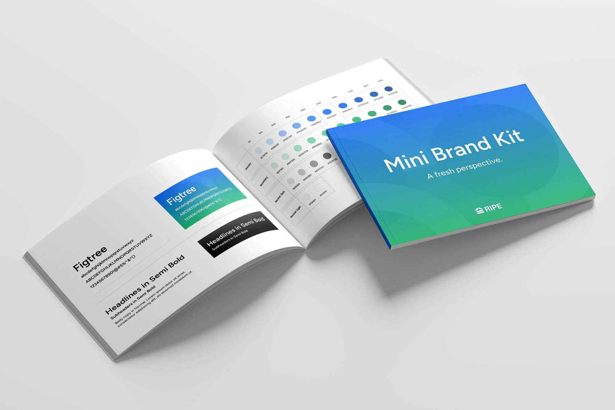
Introduced a bolder, more expressive color palette to reflect the energy of the authors and their stories
Simplified brand elements to maintain a clean, confident presence
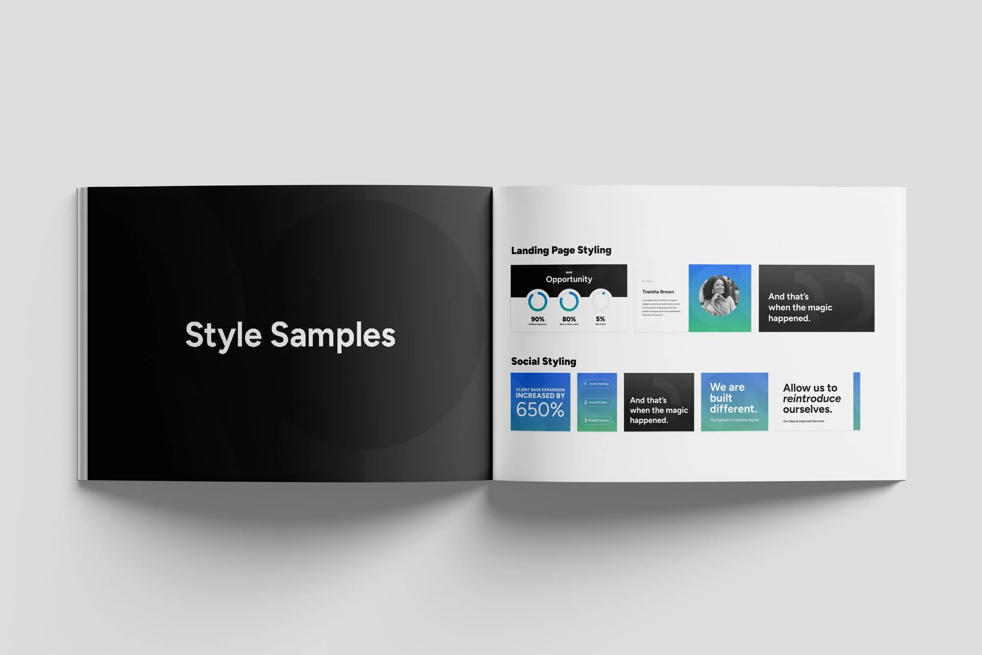
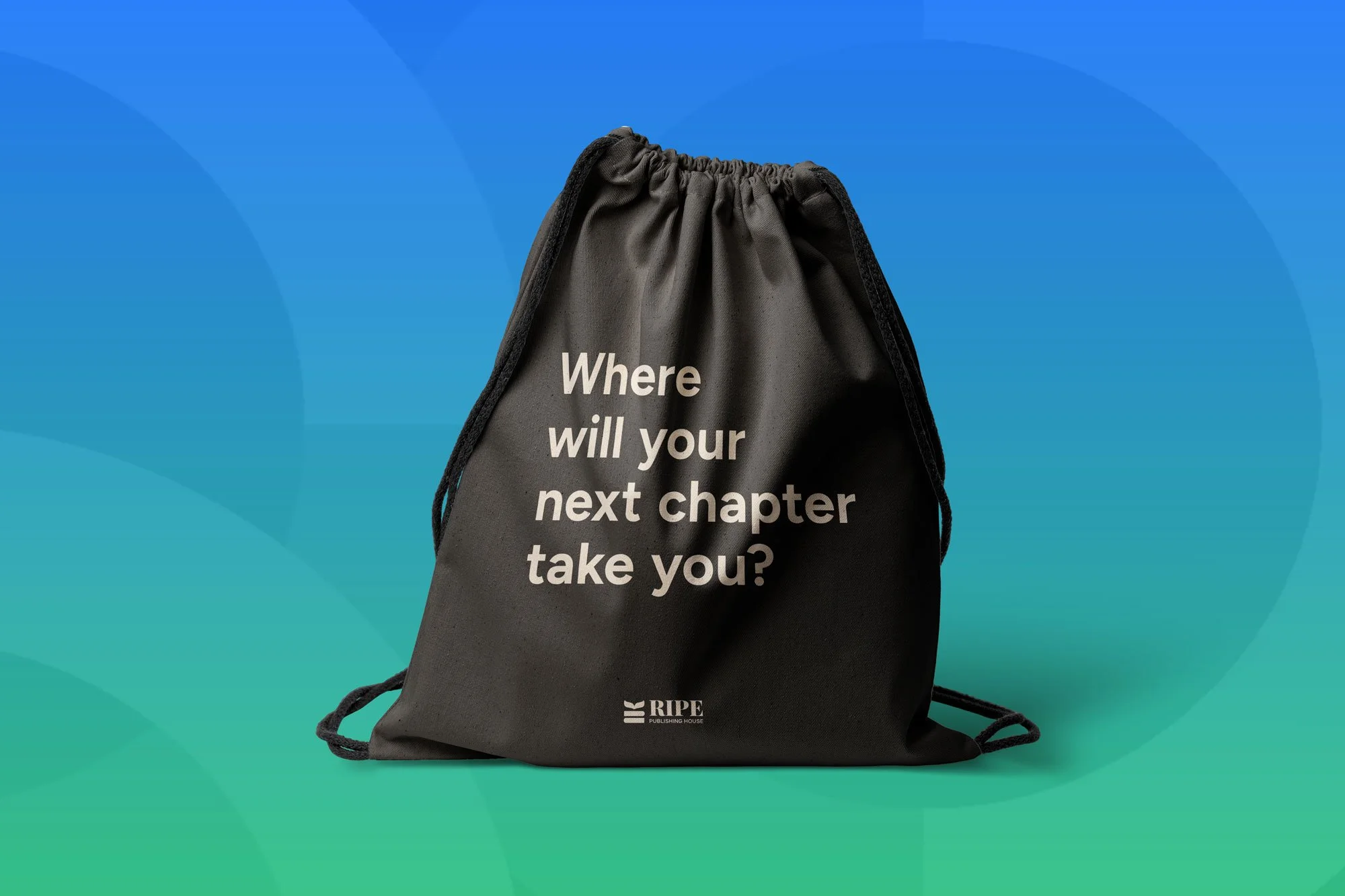
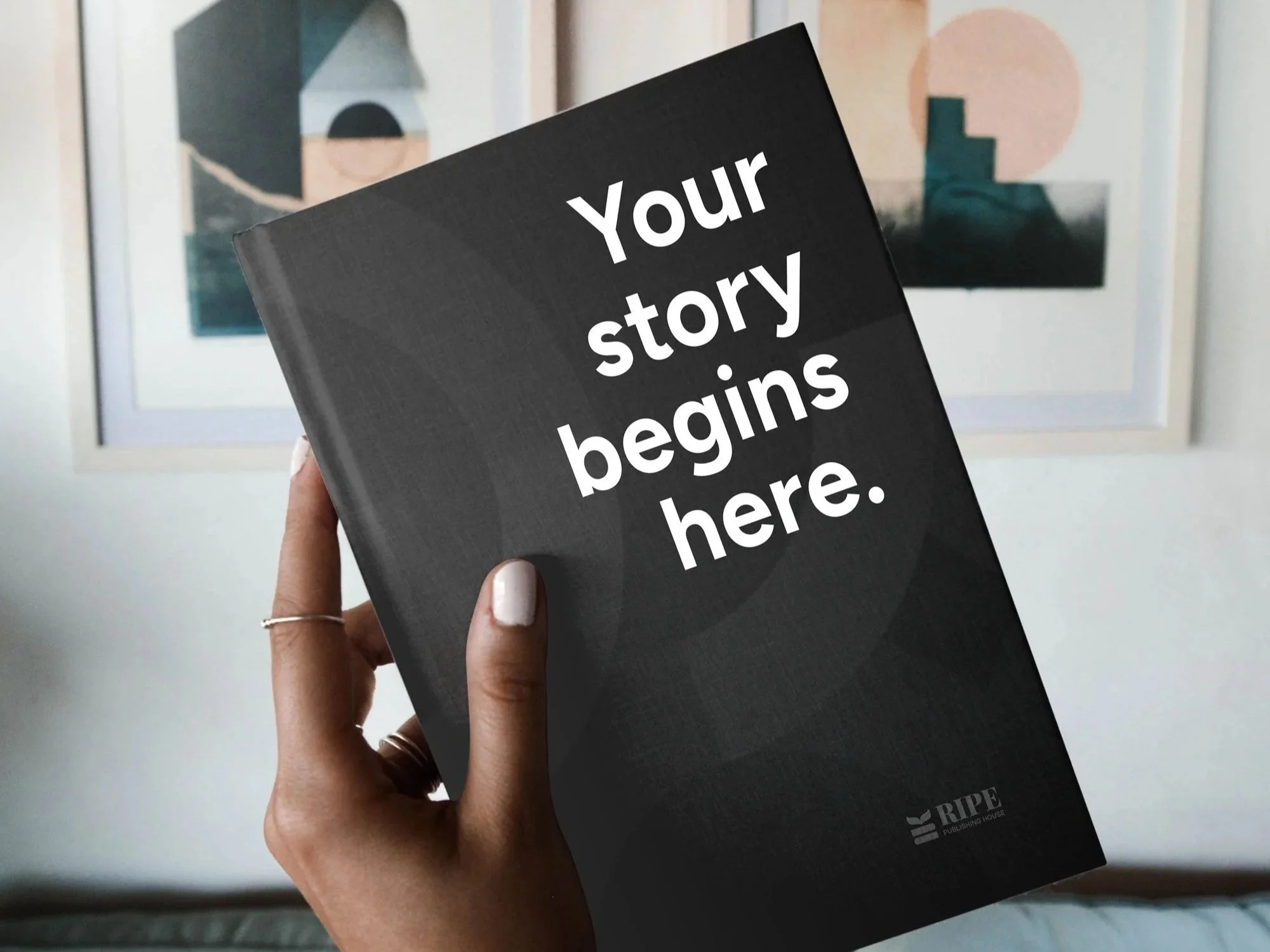
Created a flexible, user-friendly design system
Developed ready-to-use templates that work seamlessly across digital and print platforms
MY ROLE
I led the visual refresh by simplifying and streamlining the brand, introducing bold, expressive color, creating an energized yet approachable look, and ensuring the design system remained production‑conscious.
OUTCOME
The result was a refreshed identity rooted in clarity, vibrancy, and usability, expressive yet easy to maintain with the brand now achieving:
A cleaner, more confident visual identity
A vibrant color system that feels dynamic and culturally resonant
A cohesive, literary-forward brand presence
A sustainable design toolkit tailored for a small, growing team