THE CHALLENGE: find center. makE a mark.
The therapist needed a cohesive, professional brand identity that could be used immediately, clearly communicate his services, build client trust, and help him stand out in a competitive, client‑focused market.
APPROACH
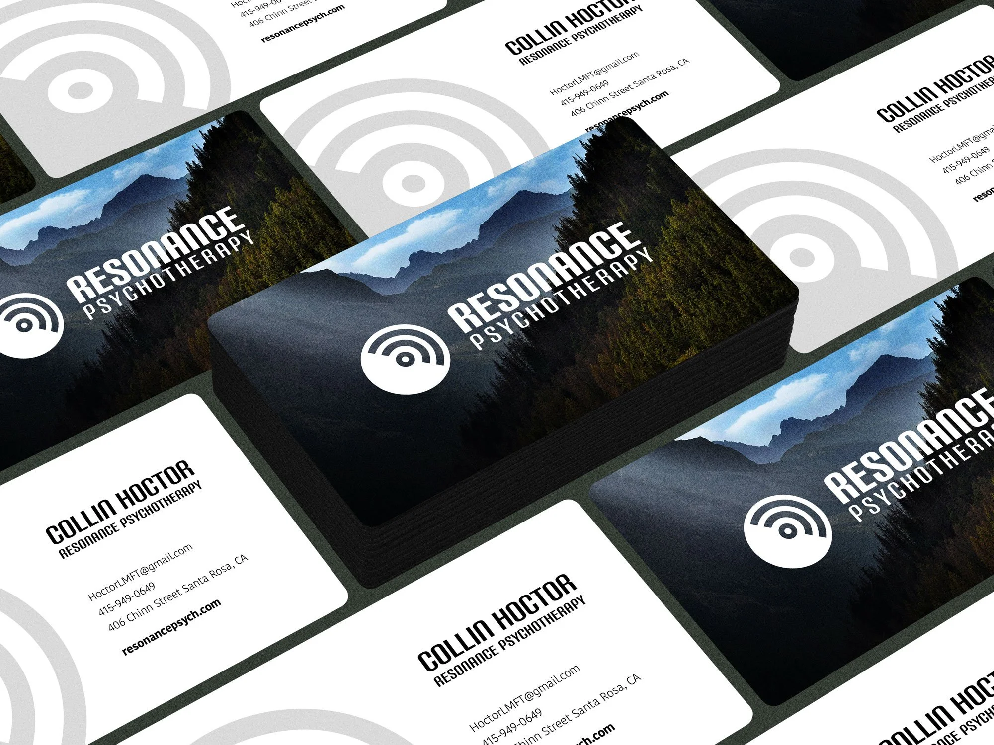
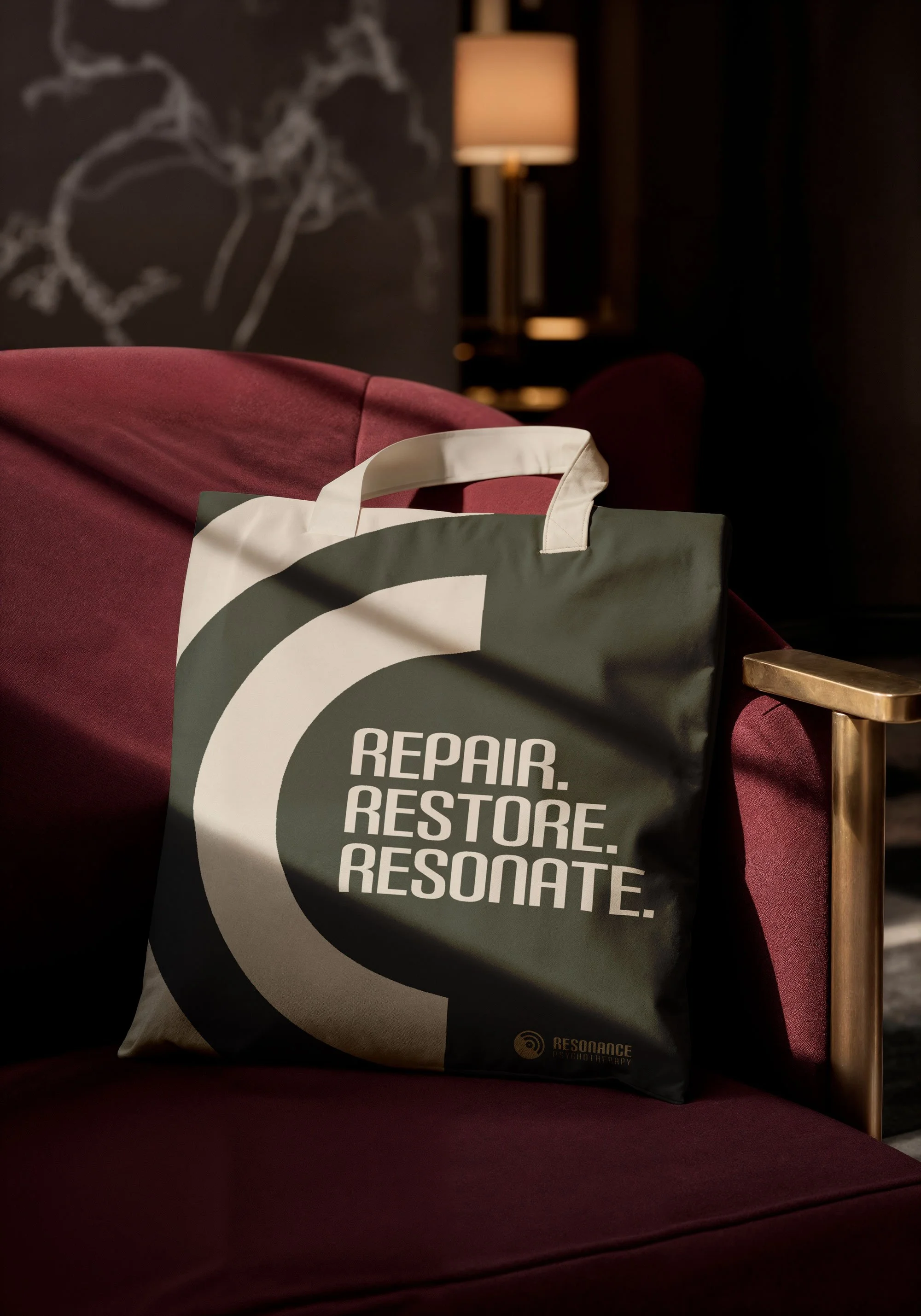
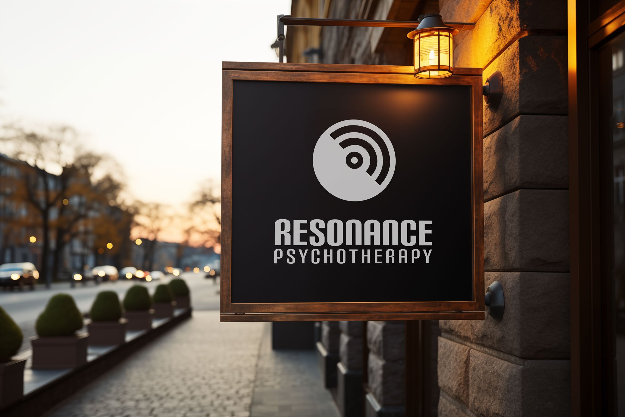
Designed a logo with the circumpunct as the core focus, balancing stability and rhythm through shape and contrast, and paired with a strong tagline to enhance the visual narrative while keeping the mark clean and focused.
Created branded swag and collateral for client engagement and recognition.
Developed a website that clearly communicated services and presented a professional, approachable online presence.
MY Role
I led the branding effort, working closely with the therapist to define his visual identity and deliver polished, client-ready assets.
The circumpunct became the natural starting point, not just as a symbol, but as the foundation for a cohesive visual language. Every design decision, from font choice and weight to alignment, was intentional, maintaining clarity without overcomplicating the result.
OUTCOME
Delivered a modern, cohesive brand identity with ready-to-use assets.
A consistent, professional presence across all client touchpoints, grounded in a strong visual language.
The circumpunct-based system provided clarity, focus, and flexibility, giving the therapist a polished identity that resonated immediately with clients.